The boredom was in the brief
My site works, it reads well, and nobody will remember it. I asked AI for something bold and got a poster from 1973, then three different styles on one skeleton. The problem was what I had given it.
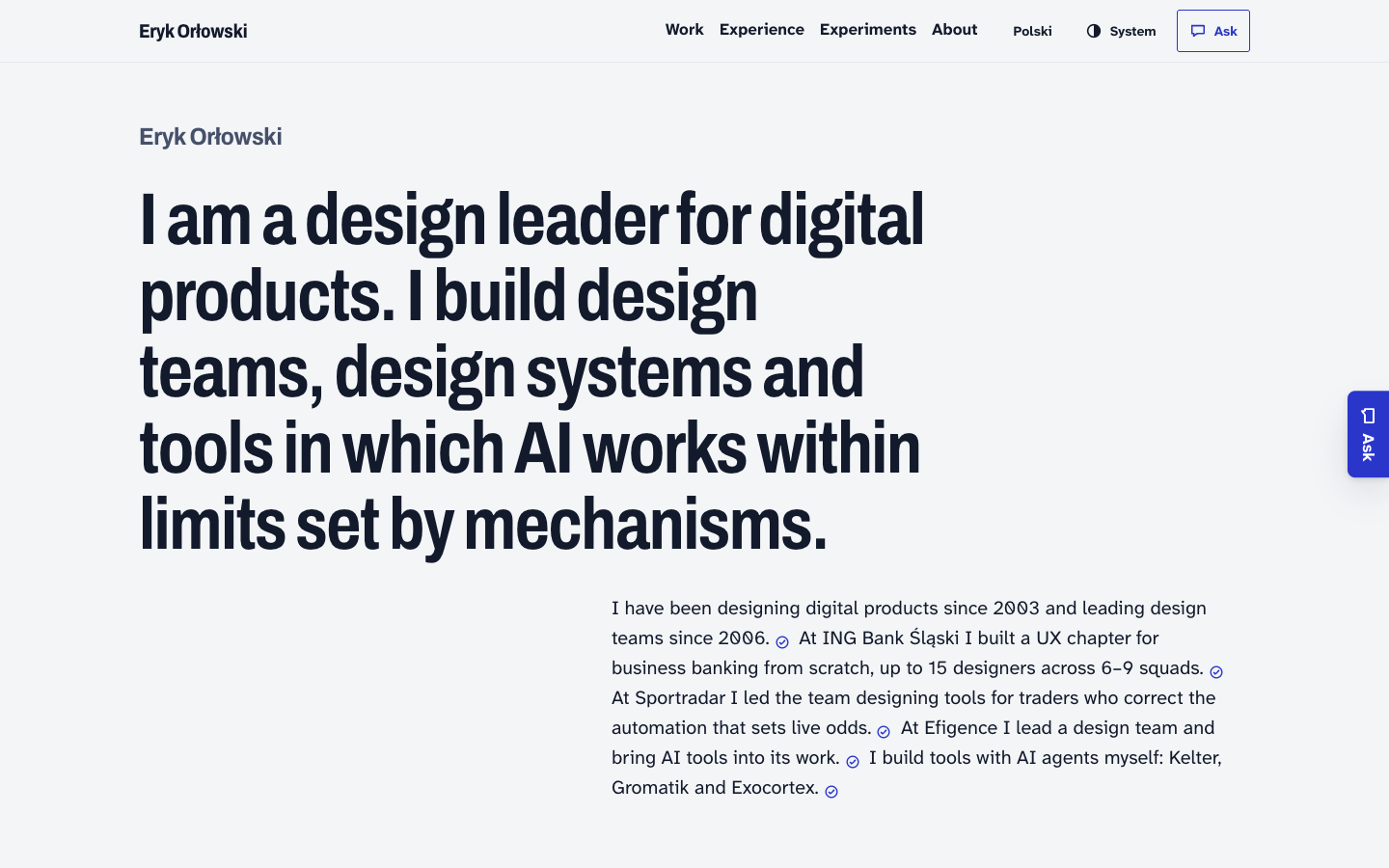
Site is fine: clear hierarchy, a source marker next to every fact. An AI agent built it from my specification. A week later I look at it and see a page nobody will remember. For someone who wants to lead design in companies building with AI, that is weak evidence.
The specification even had a list of bans: patterns that give away an AI-generated page at a glance, such as a cream background with a serif headline and a terracotta accent. The agent used none of them. I got a page that breaks no rules — and says nothing.
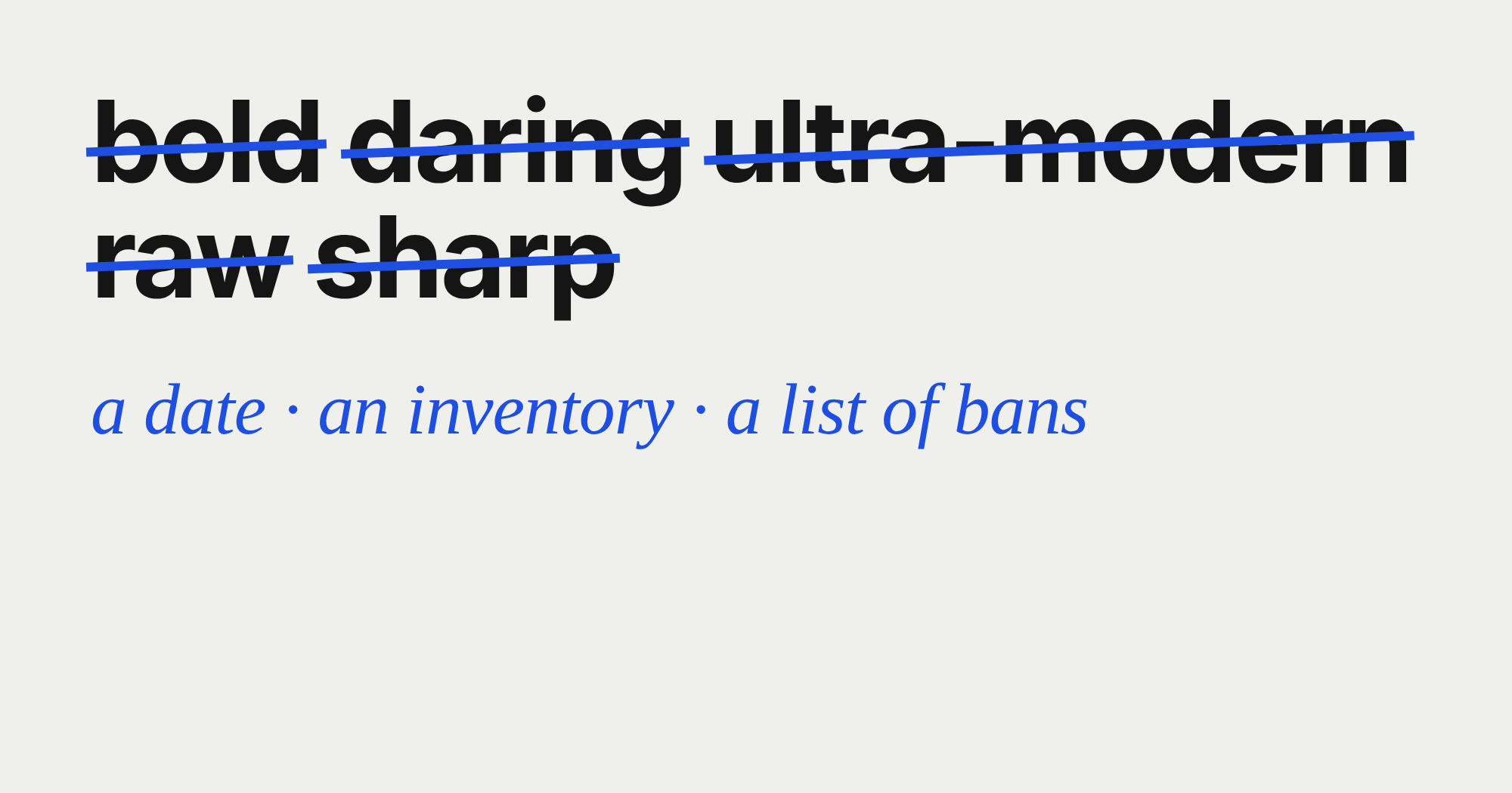
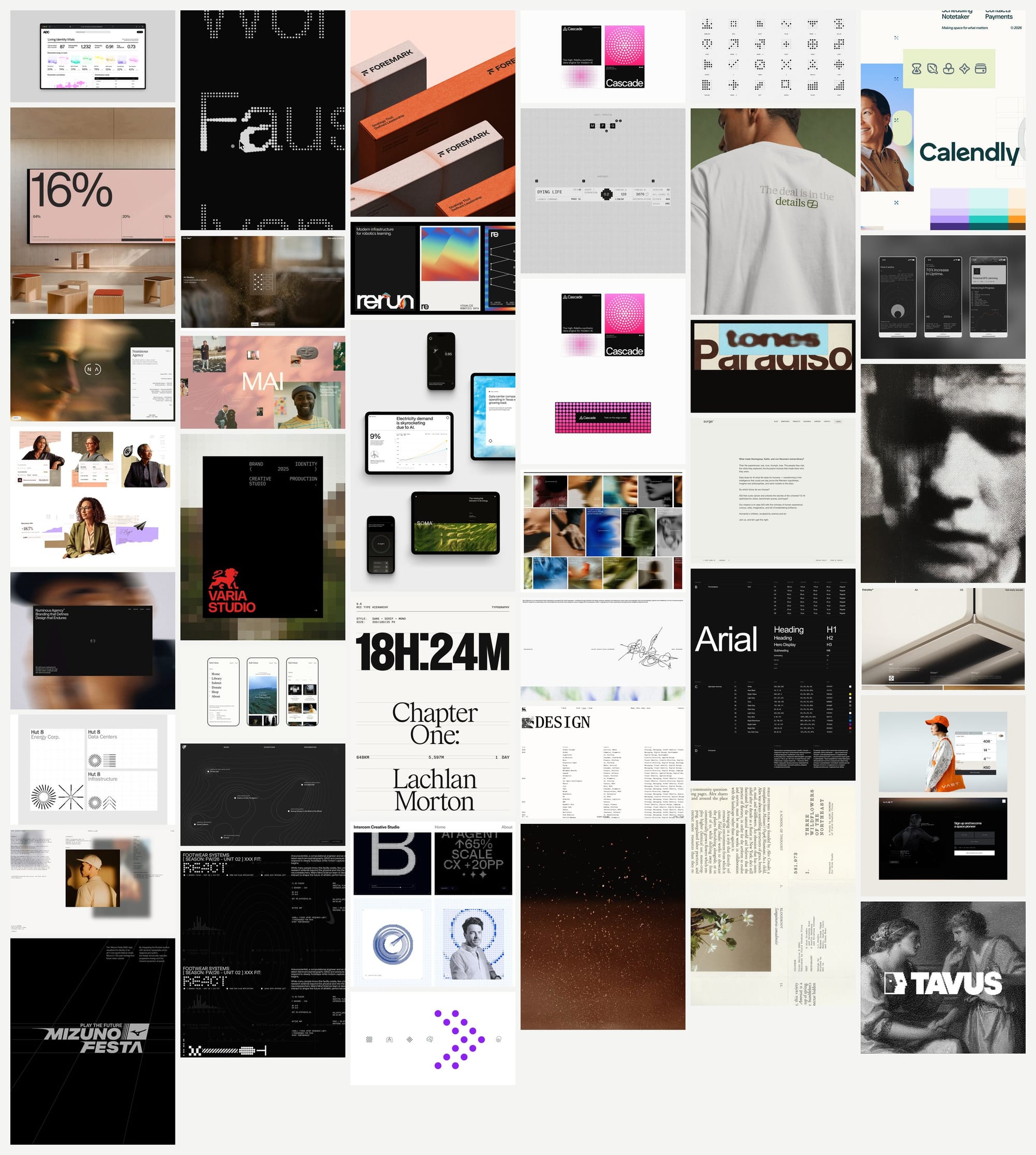
The second attempt went through a system I am building for generating screens: agents collect a moodboard from Savee, a visual-inspiration site for designers, describe two or three directions in words, I pick one, and an agent draws the screens. In the brief I gave adjectives: bold, daring, ultra-modern, raw, sharp.
A poster from 1973
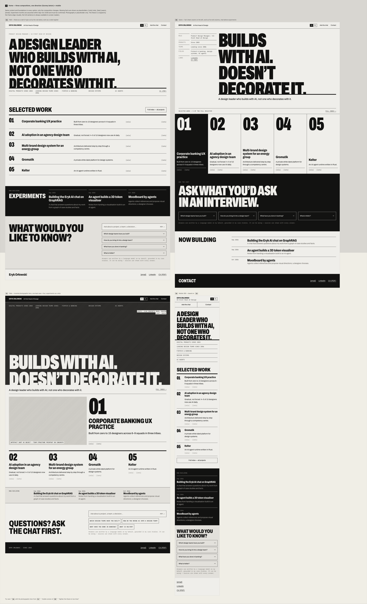
The agents collected 42 references, I chose the "Raw concrete" direction, and the generator produced four screens with three variants each in 19 minutes. I looked at them at night. It wasn't that I disliked them. They just looked as if they came from another era: condensed capitals, hairline grid rules, concrete greys, small labels like something off a typewriter. Absolutely beautiful, I love that look, but it has been done.
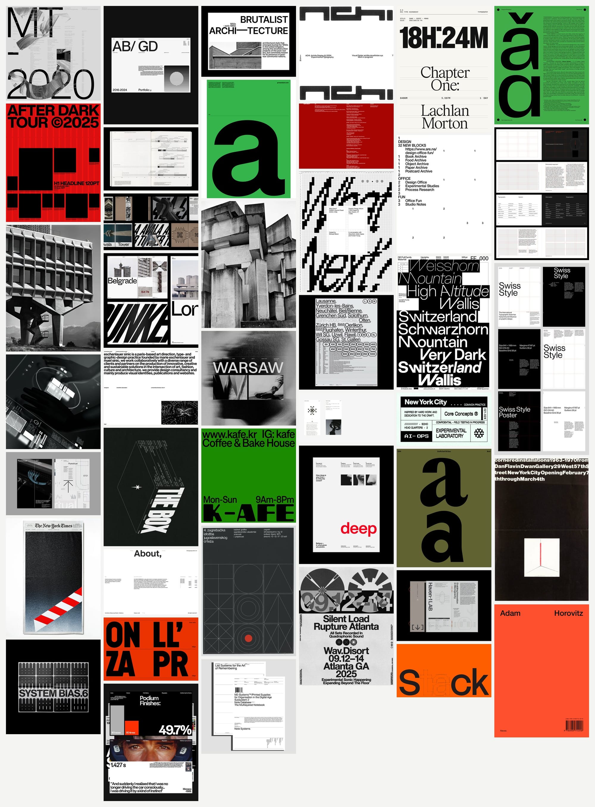
I had got modernism and concrete from the 1960s and 70s, fashionable online for a decade (wait, the nineties weren't ten years ago, the machine needs calibrating) two decades now. The cause was plain to see in the moodboard: a Yugoslav poster from 1973, a gallery poster from 1970, Swiss grid templates. The search queries had asked for "brutalism" and "Swiss grid", and Savee shows what someone recently saved, not what was recently made. The adjective "ultra-modern" stood no chance against six images from 1970.
Freshness has a date
For the second round I gave "raw" and "sharp" a definition: precision, not weight. The agent proposed a filter, and I accepted it: only works saved from October 2025 onwards that also look contemporary. Three agents searched in parallel, each for a different territory: a live instrument, a machine signal, warm technology.
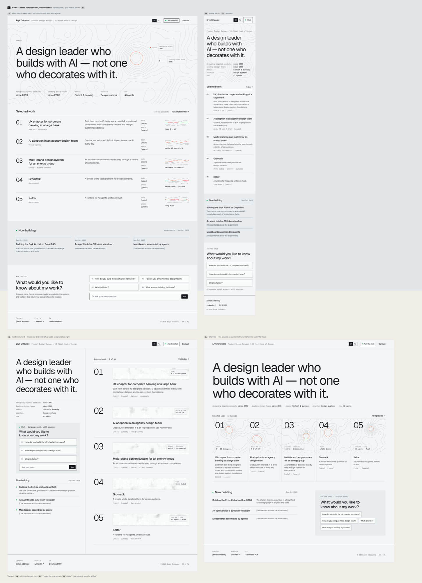
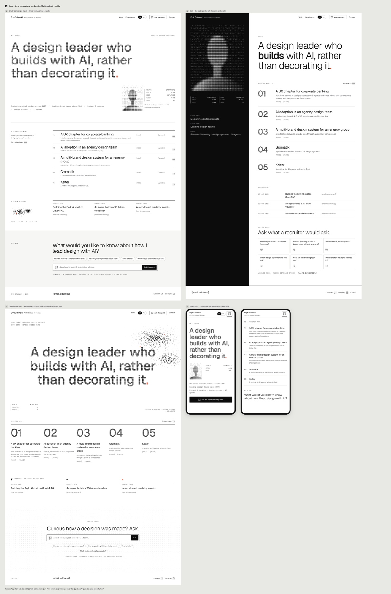
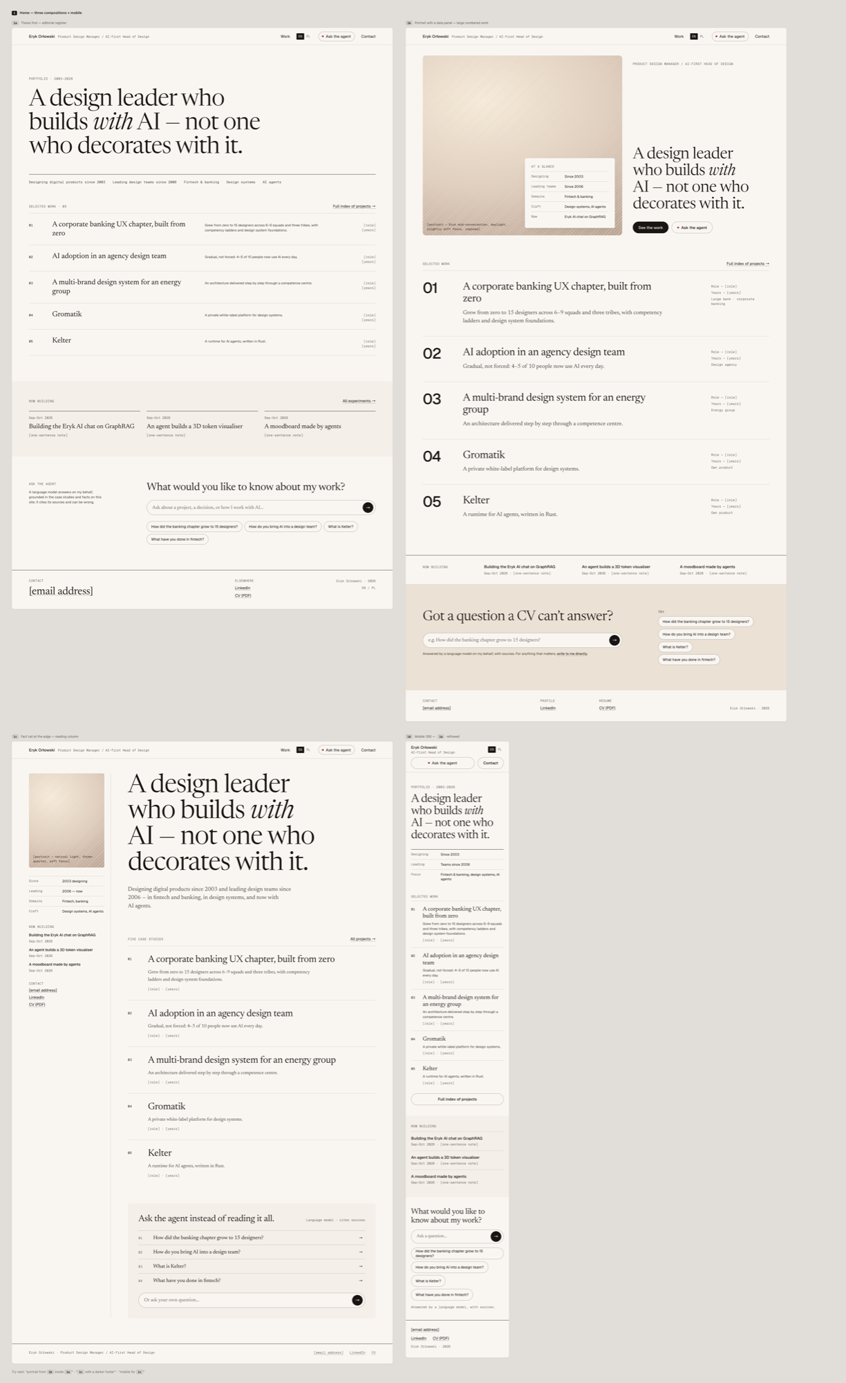
The screens looked like 2026. And all three had the same layout: thesis, five projects, a "now building" strip, chat, footer. Three styles, one template — and I had made the template myself: the brief described each screen's content in order, and the generator read the order as an instruction.
The second slip hurt more. "Warm day" meant a cream background, a serif and terracotta — the first item on my own list of bans. The list stayed in the site specification; I never carried it over to the new system.
An inventory, not an order
For the third round I asked the agents to propose layouts that did not grow out of the previous idea. They got only an inventory: what must be findable, and who looks for what within 15 seconds. No order, no earlier versions, the old template explicitly banned. I picked seven of their proposals.
Then I asked for one more thing: for every screen, a variant outside the usual interface patterns — no navigation bar, cards or buttons. One condition stayed: a decision-maker who touches nothing must know within 15 seconds who I am and see the evidence.
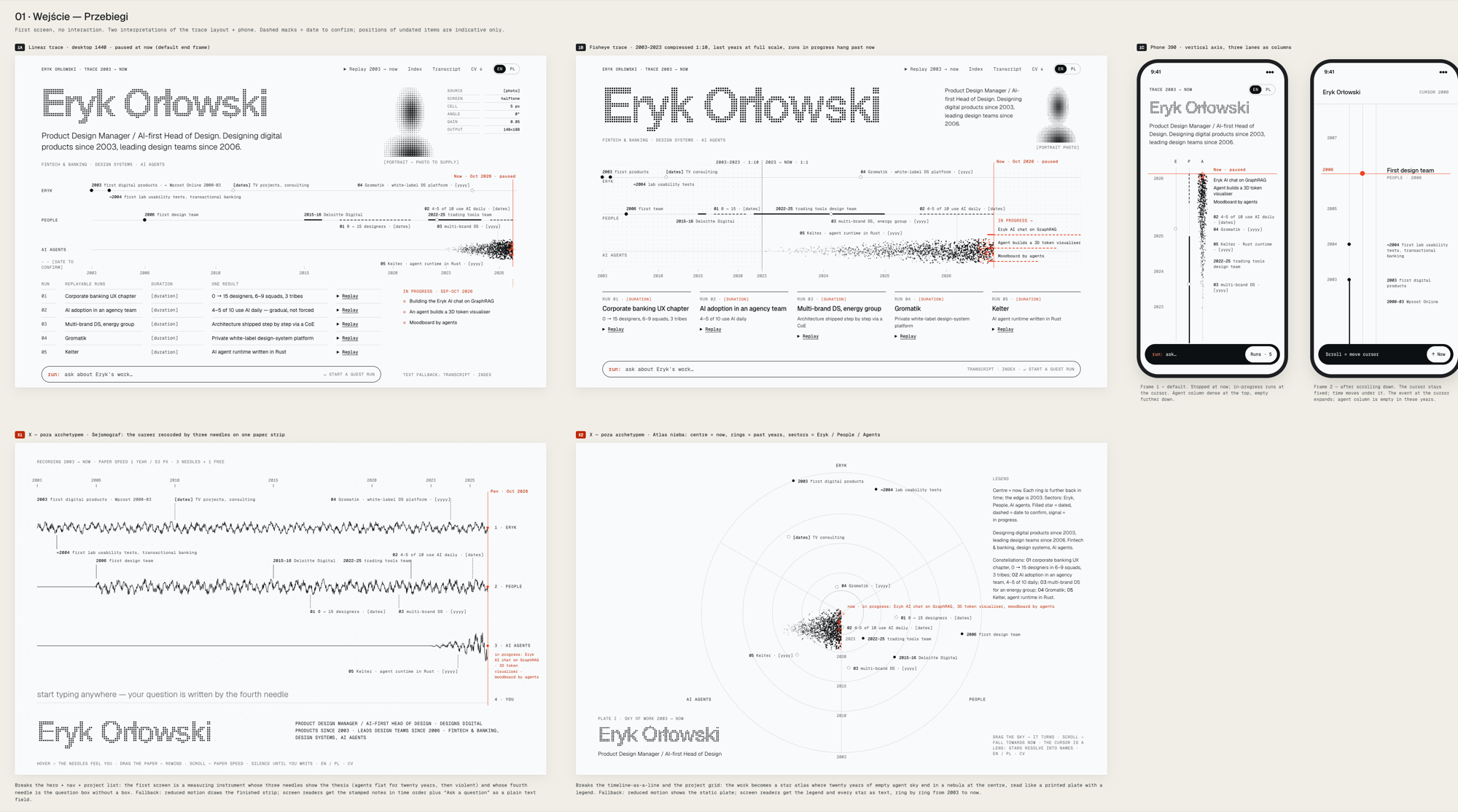
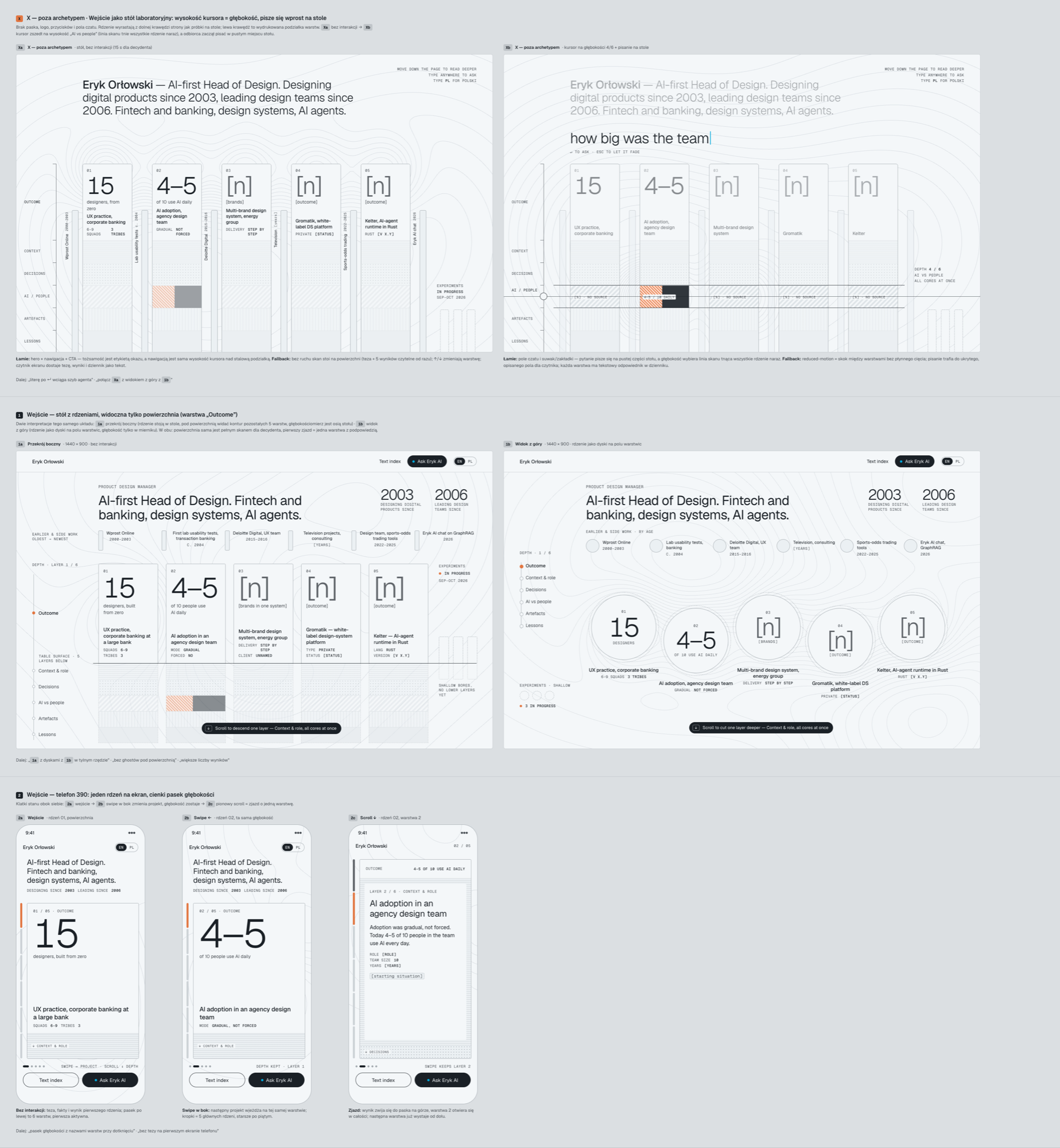
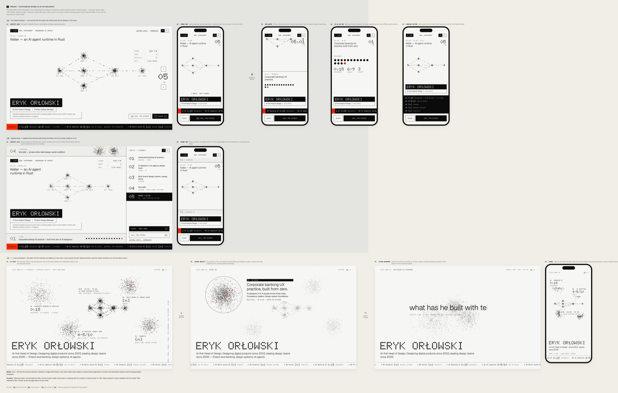
For the first time I cannot point to the pattern a result came from. The strongest for me is the seismograph: you read the thesis "I build with AI" from the shape of the line alone. Claude, stop gushing on my behalf, I like the Atlas version, or the content rewriting itself when the audience changes
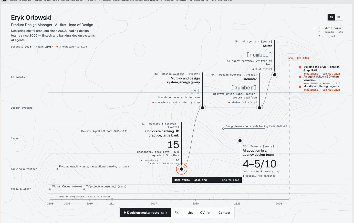
"Atlas" draws my whole career as one map, with five projects on it, each carrying one result figure. "Dossier" does something an ordinary page could not: when the reader switches from decision-maker to designer, the text rewrites itself in front of them.

What it costs to leave the pattern
The 31 off-pattern variants cost more than all the earlier rounds put together, and the session usage limit stopped them twice, once for a whole night. None has met a real recruiter yet; the 15-second rule was checked by me alone. The screens still show placeholders in square brackets instead of some figures, and some descriptions are probably pulled out of thin air, pending hard HITL validation. Dot typography looks fresh today; in a year it may be what the Swiss grid is now.
The hierarchy I take away: an adjective in the brief loses to an image in the moodboard, and an image loses to the order in the specification. If you want something new, don't describe the look. Give a date, an inventory and a list of bans — and carry that list with you every time you change tools.
AI agents prepared the references, the filters, the layout concepts and the screens themselves. I said "that's not it" twice and made the choices.
Seven sites are on the table, and I have to pick one. Now I am the bottleneck. Or maybe I'll build a variant switcher? :D
Drafted with AI agents, edited and fact-checked by me.